Jump To
Deep Dive

At Acely, an early-stage test prep startup, I led the UX redesign of the sign-up funnel, with a 2-week sprint to ship a mobile-optimized experience before Thanksgiving. By restructuring the flow into distinct student and parent paths, moving parent email capture to the point of entry, and rebuilding the checkout screen with trust signals, I addressed the friction driving 63% funnel drop-off and sticker shock at payment. As a result, total conversion nearly doubled from 4.72% to 9.01%, role-selection retention jumped from 36.47% to 80.44%, and the marketing team gained access to parent leads for key marketing initiatives.
Role
UX Consultant
Team
1 Visual Designer, 2 Marketing Leads, 3 Devs
Timeline
November 2025
(2-week sprint)
Core Responsibilities
UX audit and heuristic evaluation, information architecture, UX design and optimizations
Problem
The existing funnel pushed every user, student or parent, through the similar undifferentiated screens, losing 63.53% of them before they'd seen a single screen of value. The checkout experience jumped into product pricing without building confidence or trust, producing sticker shock and abandonment at the moment of highest intent.
Meanwhile, the business had no way to capture parent emails at sign-up. It lived in onboarding, where they were too late for lead attribution, often ignored or skipped, and not supportive of key marketing initiatives. Concurrent pricing and product offering changes were also forcing a structural rethink of the flow, which was trending leaner overall. With 80% of traffic coming from mobile plus stagnant growth, this initiative wasn't only about optimizing the funnel for responsiveness but also building trust and reducing sticker shock within a tighter, smaller set of screens.
Goals
After auditing the funnel data and evaluating the existing flow, I worked with stakeholders to get laser-focused on what would move the needle. The high-level goals included:

1
Reduce step-by-step funnel drop-off
Eliminate friction at each stage, from role selection to payment, to keep users moving toward trial activation.
2
Capture parent email at the point of entry
Move parent email collection out of post-payment onboarding and into the earliest step of the parent flow, unblocking marketing attribution and parent-targeted lifecycle flows.
3
Build purchase confidence at checkout
Redesign the flow with trust signals and value reinforcement to reduce sticker shock and lower abandonment at the highest-intent moment in the funnel.
Solution
The old flow pushed every user through the same screens regardless of context or intent. I restructured the IA to branch at role selection, creating tailored student and parent paths, while rebuilding the checkout experience to convert users who were already motivated enough to see pricing. The core constraint throughout: the team was resistant to adding screens, so every decision had to build trust and reduce friction within a leaner flow, not by expanding it. I worked alongside a visual designer, the marketing team, and the engineering team to launch the redesigned funnel within a two-week sprint right before a holiday break.
Before
Parent email was collected deep in onboarding, too late for lead attribution and unavailable when the StartTrial conversion event fired. By deferring the parent email until later in onboarding:
Marketing systems used student identity as the lead (via signup email), not the parent.
Revenue and LTV was attached to whichever email was captured earliest (i.e. student), not to the actual billing owner.
There's some noise when analyzing CAC vs LTV at the household level.
After
Email capture now appears at the first step of the parent flow, giving the marketing team a vital lead data point from the moment a parent expresses intent.
This was a hard business requirement. The marketing team needed parent emails to build lead nurture flows and improve Meta conversion tracking. The UX challenge was integrating the capture without adding friction before payment. Placing it at the very first step, before any pricing exposure, made the ask feel natural rather than transactional, and immediately unlocked downstream marketing infrastructure the team had been blocked on.
Before
A bare pricing screen with little to no trust or validation signals left users facing sticker shock with nothing to anchor their confidence in the purchase. The prior screens also had limited context showcasing the value or benefit of the platform.

After
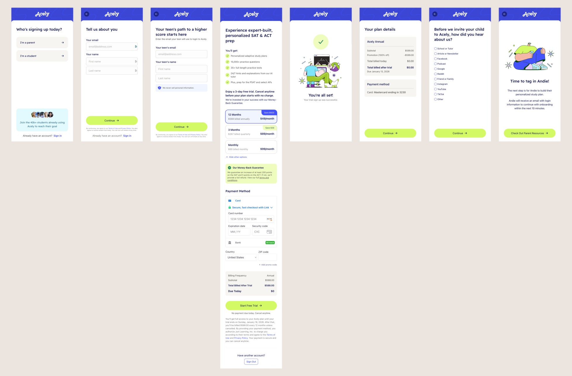
A rebuilt checkout experience with a pricing toggle, money-back guarantee callout, value props checklist, and Trustpilot social proof reframes the decision from cost to value.
The checkout redesign was the highest-leverage intervention in the funnel. Users who made it to payment had already committed enough to see pricing. The drop-off there wasn't about the price, it was about confidence. Adding a money-back guarantee, a clear value props checklist, and verified social proof gave users the signals they needed to complete the purchase. Payment page reach doubled from 22.87% to 49.44%.
Separating the paths addressed a fundamental mismatch between user context and screen content. Parents signing up for a teenager need different information at different moments than students signing up for themselves. By branching the IA at role selection and tailoring each screen accordingly, I reduced cognitive load and gave both user types a clear, relevant path forward. Role-selection retention jumped from 36.47% to 80.44%.
Before
Every user moved through an identical flow regardless of whether they were a student signing up for themselves or a parent signing up for their teen.

After
Role selection now routed users into distinct flows with context-specific content, copy, and IA, including a parent-to-student handoff that sets clear expectations for next steps.
Student

Parent
Impact
91%
relative lift in end-to-end sign-up conversion (4.72% to 9.01%) measured over 2.5 months post-launch
80.44%
role-selection retention, up from 36.47%, reducing drop-off significantly
2x
users that reached payment page (22.87% to 49.44%)
Deep Dive
Audit
The data told the first half of the story with a 63.53% drop-off at role selection signaling that users were hitting friction before they'd seen any value. The heuristic evaluation further validated assumptions and identified a generic flow that failed to match content to context, a checkout screen stripped of trust signals, and parent email capture buried in onboarding where it served neither the user nor the business.

Ideation
I started with a competitive analysis of sign-up flows in comparable markets to identify patterns that worked: what reduced anxiety, what built trust, where to collect information without interrupting momentum. From there, I sketched the IA before moving directly into Figma to iterate. I worked closely with the visual designer, Andie, who shaped the visual framework and branding while I led IA, user flow structure, and content strategy decisions.
The first round of designs had considerably more screens, each targeting a specific friction point. After presenting to the team and workshopping which screens were load-bearing versus negotiable, we culled the flow down to a handful of high-impact steps. It's not unfamiliar to have some resistance between business requirements and user needs, which is why our job is to find the healthy balance that meets the expectations of both parties. And that resulted in a proposal to ship a leaner baseline now with future A/B tests lined up to quantitively measure the conversion impact of adding a screen before committing to it, rather than guessing.
Iteration 1

Iteration 2

Research
Shipping without pre-launch usability testing was a deliberate call. The audit and competitive analysis had made the failure points clear, and the redesign addressed each one directly. After launch, I conducted research on the signup flow to give the team the qualitative context they needed to prioritize the next iteration. PostHog confirmed what the design had bet on: role-selection retention more than doubled, payment page reach nearly doubled, and total conversion climbed from 4.72% to 9.01% within the first 2.5 months post-launch.
Reflection
The 2-week sprint didn't leave room for a conventional pre-launch research cycle, and that was the right call. Coming in as a contractor, I had about a week to absorb company context, team dynamics, past optimizations, and existing research. What I could lean on was the posthog data audit, the heuristic evaluation, and years of having run this type of research across comparable products. The checkout redesign, the role-aware IA and user flow, and the email capture placement was grounded in patterns that consistently move conversion metrics. Urgency didn't compromise the work. It sharpened the focus.
Reflecting on the process, one factor I wish I would have considered earlier is the mobile-desktop conversion gap. Post-launch data showed desktop converting at 12.59% versus 5.92% on mobile, a gap that, while not unusual given Meta traffic behavior, pointed to mobile-specific friction the sprint hadn't fully resolved. Knowing that gap going in would have shifted more of the sprint's attention to reducing motor load on the mobile payment screen specifically. Going forward, I aim to build explicit mobile vs. desktop conversion benchmarking into my audit from day one, so gap analysis shapes the design brief rather than follows the launch.


