Jump To
Deep Dive

At CircleIn, an early stage edtech startup, I led the strategic redesign of the flashcards experience aimed to amplify user engagement and elevate academic outcomes for undergraduate college students. By addressing key user pain points and tackling critical usability issues, I streamlined the ability to find, create, and study flashcard decks. As a result, the reimagined flashcards experience resulted in a 35% increase in user engagement of Daily Active Users (DAU), 28% increase in won customer contracts, and became the platform's second most popular study tool.
Role
Lead Product Designer
Team
1 PM, 2 Devs
Timeline
Apr - June 2021
(2 months)
Core Responsibilities
User research and analysis, feature prioritization, ux design, and usability testing
Problem
Students were spending hours creating flashcard decks, only to either lose all their work or be unable to find the flashcard deck they created, leading to user frustration, churn, and loss of trust. Alongside a frustrating experience, customer contract renewal negotiations were closing in and stakeholders expressed the urgency of increasing engagement and usage metrics.
Goals
After interviewing user feedback and stakeholder objectives, I worked with the product manager to refine the product requirements and get laser focused on the goals for the flashcards redesign. The high-level goals included:

1
Improve user retention and confidence in the study tool
Address and resolve the critical friction points identified by user feedback and support tickets to prevent students from abandoning our product for competitors.
2
Improve system visibility and drive trust
Ensure that students' efforts in creating flashcard decks are preserved, thereby restoring trust and reducing the frustration associated with content loss.
3
Optimize the experience for engagement and ease of learning
Conduct a comprehensive redesign based on heuristic evaluation findings to reduce usability issues and enhance the overall studying process.
4
Achieve timely and impactful delivery
Align the redesign with urgent business and user needs and collaborate with the PM and engineers to prioritize high-impact solutions that can be implemented efficiently.
Solution
The team's collective efforts pivoted flashcards from a disconnected studying experience to a functional and user-centric interface, that improved the ease of studying and engaged students with interactive learning.
The introduction of a flashcards list view allowed students to easily access their past decks instead of having to scroll or search tirelessly to find a deck from their class feed. Color was also used as a visual cue to highlight and differentiate between class-specific decks for easier recognition and usability. Students could now also bookmark flashcard decks to keep most relevant content easily accessible.
Before
No visibility into previously created flashcard decks led to frustrated students

After
Past decks were now easily accessible, making studying more efficient

Previously, users could only input one card at a time and would require additional steps to review past cards created. I redesigned the creation process as a list view so users could now easily see and navigate between all cards created, speeding up the time to completion and studying. In addition, I worked with engineers to implement the auto-save functionality while presenting the status on the UI as students update their deck.
Before
A slow, ineffective process that requires frequent recall due to the single card view

After
Reduced the cognitive and motor load of creating flashcards for more efficient studying

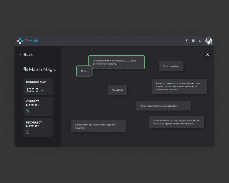
We were losing users to Quizlet due to a limited study experience. I designed an interactive flashcard mode that reduced churn, increased engagement, and improved study outcomes.
After
Interactive studying flashcards game
After
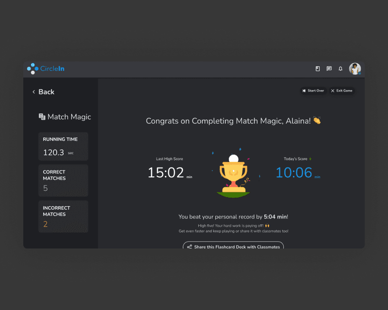
Rewarding behavior to drive engagement and retention
Impact
Igniting Growth: Transforming Tynker's Sign-Up Flow for Parents and Paving the Path to Purchase
35%
increase in user engagement of DAUs from previous school term
28%
increase in won customer contracts compared to previous school term
Top 2
Ranked as the second top used feature on the platform
Deep Dive
Audit
The existing flow of creating flashcards was complex and inconvenient, often requiring constant recall and unnecessary cognitive and motor load, ultimately slowing down the creation process.

Ideation
From sketches to iterative design cycles, I was able to reimagine the experience found the ground up. Guided by user feedback and internal design reviews with my peers, I was able to stay user-centric and rule out ineffective solutions prior to usability testing.

Sketches of various flashcards screens

High-level overview of the redesigned flashcards experience on the web app
Validation
With every redesign comes a bit of risk. In order to de-risk some of my assumptions and to get approval from stakeholders prior to development, I tested an early prototype of the designs with our users.
The usability experiments resulted in exceptional high task completion rates (>85% vs. 78% industry benchmark) and above average SEQ scores (>5.5 industry benchmark) for 4/4 tasks for Web.
The new flow and redesign of the flashcards experience resonated well with our users. This was enough signal necessary to push the redesign to development.
Reflection
Facing a tight deadline to boost user engagement, close collaboration with the product manager and engineers was crucial to balance trade-offs, from research methods to design scope, for maximum impact with minimal complexity. The high stakes underscored the value of early usability testing to confirm the effectiveness of our solutions before development.
Reflecting on the process, one factor I wish I would have considered early on when building the new experience was creating a feedback loop (e.g. on-site survey) to collect data on user satisfaction (i.e. Customer Satisfaction Score or Customer Effect Score, for instance). Going forward, I aim to integrate more closely with our technical team to to ensure the proper end-points and/or infrastructure are in place to facilitate data-driven evaluations of user experience improvements.


