Jump To
Deep Dive
At McKinsey & Company, I led the strategic redesign of SaaSRadar, the financial benchmarking platform built by Fuel, McKinsey's practice serving high-growth SaaS companies. Client Services Teams (CSTs) and business analysts use SaaSRadar to build peer sets of comparable SaaS companies and generate the benchmark reports that power client proposals and diagnostics. The interface had outgrown the product's expanding capabilities, so I redesigned the benchmark report experience from a one-chart-at-a-time canvas into an analytics dashboard that streamlined how analysts create, assess, and report on peer sets. The redesign contributed to a 16% increase in Client Service Teams supported in studies compared to the previous year and quarter, generated 1.16x the 2022 revenue by end of Q1 2023, and helped grow revenue 176.75% by the end of 2023 compared to 2022.
Role
Lead Product Designer
Team
Product Manager, 3 Devs
Timeline
Nov – Dec 2022 (1.5 months)
Core Responsibilities
User research (contextual inquiry and usability testing), UX strategy and prioritization, and UX design
Problem
As SaaSRadar's chart library and database grew, the original UI patterns no longer supported the new capabilities the app had to offer. Contextual inquiries and user interviews revealed analysts clicking through a tabbed interface to view one chart at a time, filters that buried themselves further down the page with every addition, and constant scrolling between the filters and the financial overview table to confirm the right parameters were set. Peer sets visibility didn't exist in-app, so analysts couldn't see which companies were included until after saving and downloading, so adding or removing one meant manually editing the Excel output offline or going back and forth in the app.
Goals
After synthesizing the contextual inquiry findings and user feedback, I worked with the product manager to prioritize the changes that would move usability and revenue together. The high-level goals included:
1
Bring the analysis into one dashboard view
Increase visibility and access to multiple charts and key financial performance analytics at once, replacing the one-chart-at-a-time tabbed experience that forced constant recall.
2
Reduce the motor and cognitive load of creating a peer set
Streamline the process of generating reports so analysts spend their time assessing data, not scrolling and clicking to find it.
3
Expand filtering and chart customization for bespoke studies
Improve filtering capabilities and interface layout so analysts can support bespoke proposals directly in the app instead of manipulating Excel exports.
4
Grow the number of studies SaaSRadar supports
Align every design decision with the business goal: more proposals supported, more new studies won, and more direct fees generated by the asset.
Solution
Working within the existing design system, I focused the redesign on information hierarchy and the intentional placement of elements. The result pivoted SaaSRadar from a fragmented, tab-by-tab experience into a dashboard analysts could read at a glance and manipulate quickly.
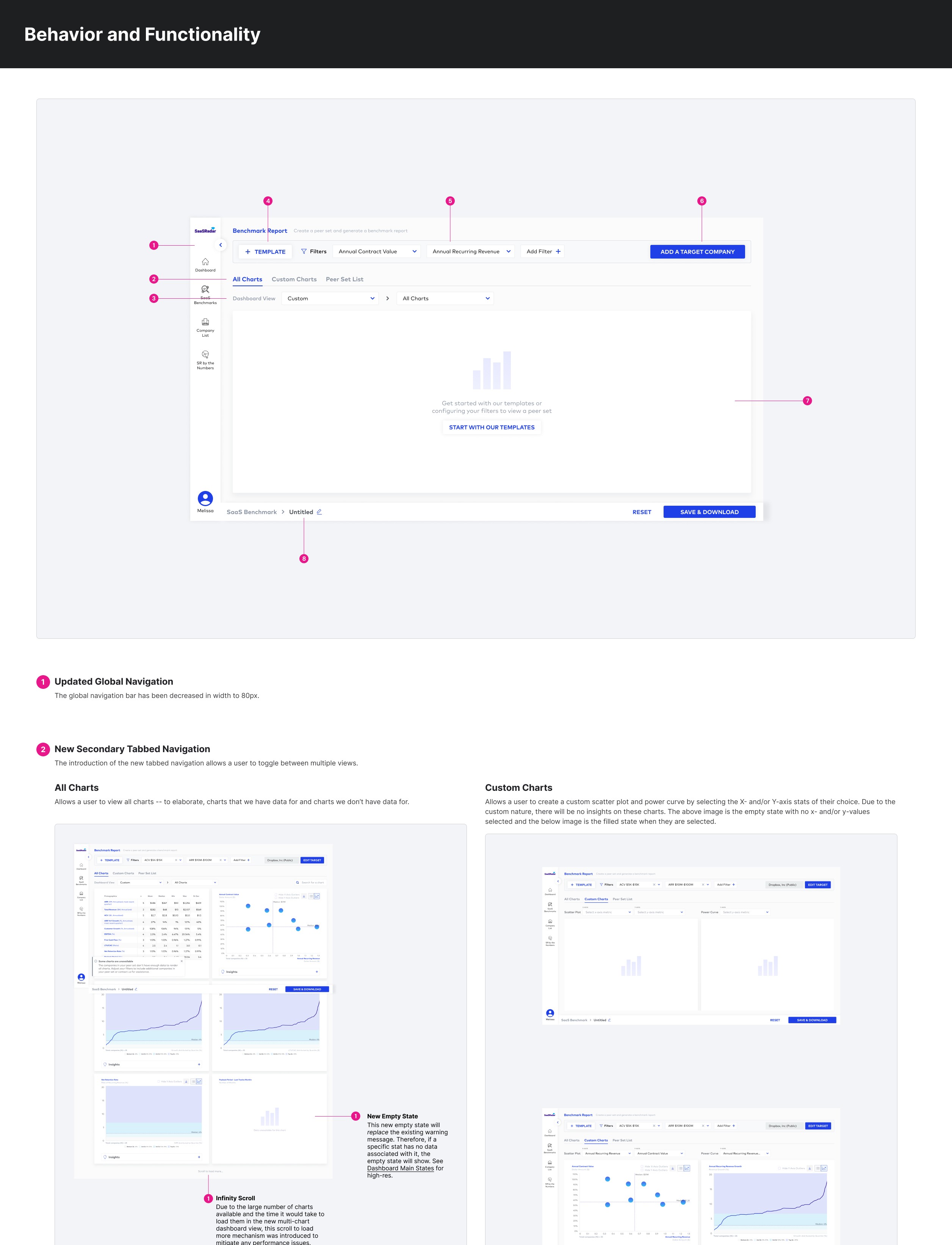
With several use cases to serve identified from user interviews, I segmented the content into logical groupings with a tabbed navigation bar: All Charts, Custom Charts, and Peer Set List. I introduced a dashboard view where analysts choose a chart grouping and see up to seven charts at once. What previously required clicking through every tab and recalling each chart from memory now happens in one continuous read.
Before
Analysts clicked through an ever-growing row of tabs to see one chart at a time, making it slow to assess whether a peer set was even right
After
Multiple charts render alongside the financial overview in a single dashboard view, so analysts assess the full picture before downloading. They were also now able to search for a chart directly.
Usability testing revealed that analysts adjusting ARR and ACV filters to accommodate small sample sizes had to scroll back and forth between the filter controls and the mean/max values on the financial overview table. I moved a sticky filter bar above the firmographics table, cutting the round trips out of the core loop of building a peer set.
Before
Confirming filter parameters and peer set data meant scrolling repeatedly between the filters in the sidebar below the fold and the financial overview above the fold
After
The financial overview sits directly below sticky filters, so analysts validate their peer set without ever leaving the viewport
Analysts told us they regularly needed visualizations the app couldn't produce (e.g. a power curve on a niche metric or a scatter plot for a one-off diagnostic). I designed a Custom Charts tab where analysts select the x- and y-axis metrics themselves, turning hours of manual spreadsheet work into a few clicks and reducing the effort required to support bespoke financial diagnostic studies.
Before
A custom chart for a bespoke client diagnostic meant downloading the Excel output, manipulating the data by hand, and formatting a chart from scratch
After
Analysts could now generate scatter plots and power curves from any metric in the database, directly in the app and within seconds.
Student
Interviews made it clear that the non-existent peer set view undermined confidence in the data itself. The new Peer Set List tab showed every company in the results with its key metrics, and let analysts add direct competitors the query missed or remove a company whose data looks stale. That transparency improved both the accuracy of the output presented to clients and analysts' trust in presenting it.
Before
Companies in a peer set were limited in view until after download. They wanted names that they could identify instead of plots in a chart that were difficult to review quickly. The back and forth of editing peer sets could take a handful of hours to a day.
After
Analysts see every company in the peer set, and can add or remove companies, before anything is downloaded.

Impact
16%
increase in CSTs supported in studies compared to the previous year and quarter
1.16x
of 2022 end-of-year revenue already generated by the end of the 2023 Q1
176.75%
increase in revenue from 2022 to 2023
Deep Dive
Research
As we got closer to the end of the year, it was important to the team to make a big bang for their buck. What would be a high impact investment that would improve revenue in the next year? I proposed running contextual inquiries and interviews with analysts, CST leaders, and stakeholders to watch how peer sets were actually built. We heard themes around the following:
"It was confusing what was in the peer set and what wasn't."
"I wish I could see multiple charts at once."
"I have to scroll back and forth between the filters and firmographics chart"
"Sometimes I need a custom chart for a bespoke diagnostic but there's no way to do that on the app."

Collaboration
The release needed to clear QA and penetration testing before the production push, and before the end-of-year code freeze. I worked closely with the engineers throughout design, validating the feasibility of each layout change as it was drawn rather than at handoff, so the remaining hours went into building rather than reworking. Clear handoff documentation and prototypes also made all the difference. The redesign shipped on time, within the budgeted hours, ahead of the freeze.
More Case Studies


Contact
Connect with me for product design, partnerships, and mentorship.